Highway Assignment
Volumes
The validation results for the Highway Assignment portion of the model are shown in this section. The observed data for 2019 volumes is taken from the Utah Department of Transportation (UDOT) Average Annual Daily Traffic (AADT) History and associated with their respective model segments. The traffic model data is taken from segment summary report for the 2019 base year model: WFv920_BY_2019_Summary_SEGID.csv. The results are divided into three sections:
- Summary Comparison
- Detailed Comparison
- Map Comparison
Summary Comparison
The summary comparison shows region and county-wide differences between model and observed for Average Daily Volume and Vehicle-Miles Traveled (VMT) by vehicle type. The values for Box Elder and Weber counties are only the portions within the MPO planning area. Validation was checked comparing the average daily volume at the region and county levels. Figure 1, below, contains an interactive view of model vs observed differences by roadway class and vehicle type.
At the region level model volume is 1.7% higher than observed volume. The four more urban counties (Weber, Davis, Salt Lake, and Davis) were all within approximately 5% of observed volumes with Salt Lake County being the closest. Weber and Davis were slightly lower and Utah County was slightly higher. Box Elder County is more rural than the other counties. Box Elder model volumes are about 10% lower than observed. Time did not allow for further calibration of the volumes in Box Elder area to account for the larger differences.
One important observation at the Collector and All Vehicles level is that Utah County shows a much higher difference than the other counties. Upon further investigation of observed Collector volumes in Utah County, many roadway segments had very low volumes compared to what was expected. Utah County is one of the highest growth areas in the region. For this reason, we expect that the observed count data may be underrepresenting actual volumes. We also anticipate observed volumes in Utah County to improve in the near-term. Within the last several years, a large investment in continuous count station in Utah County has been made. The new counters will add additional information to generate observed volumes for all roadway segments.
The largest differences in model vs observed volumes occur in the Medium Truck and Heavy Truck vehicle types. A good amount of time was spent attempting to bring model truck volumes closer to observed. However, due to the limited data sources for truck information, further need to investigate observed truck volumes, and a desire to not over-calibrate the model, further calibration was stopped. Truck modeling remains a future priority for model improvement.
Detailed Comparison
The model vs observed details in this section are presented by volume and Vehicle-Miles Traveled (VMT) through the comparison of model and observed data facility type by region and also by county. Figure 2 allows for the interactive visual comparison of model and observed values for the region and each county for all vehicles, cars, medium trucks, and heavy trucks. The comparisons are shown in four different types of charts and tables:
- Average Daily Volume by Roadway Class (2a): The daily volume is averaged across all segments within their respective geography and vehicle type.
- Total VMT by Roadway Class (2b): For each segment*, the daily volume is multiplied by segment distance and then summed across all segments within their respective geography and vehicle type.
- Model vs Count Segment Volume (2c): This is a scatter plot of segment daily volume with the x-axis as the observed volume and the y-axis as the model volume. The red line shows the location of where model and observed volumes are equal. The dashed blue line shows a least-squares linear regression. The further the blue line moved away from the red line, the further the model is from observed.
- Segment Percent Error (2d): This is a scatter plot showing the amount of error (percent difference) between the observed volume and the model volume. The observed volume is the x-axis and the percent error is the y-axis. The red lines are a bounding box that shows the control target. As volume increases, it is expected that the percent error should decrease.
As shown in Figure 2 (Region, All Vehicles), the volume and VMT of all vehicles at the region-wide level closely matches the validation targets. Volume for all roadways is only 1.7% higher than observed and VMT for all roadways is only 1.5% higher than observed.
As shown in Figure 2 (Region, Medium Trucks) and Figure 2 (Region, Heavy Trucks), the model currently overpredicts Medium and Heavy trucks. A good amount of effort was spent attempting to bring model truck volumes closer to observed. However, due to truck data limitations and other model resource considerations, further calibration was stopped. Truck modeling remains a future priority for model improvement.
In addition to the charts, the maps in Figure 3 through Figure 5 shows a comparison of segment level model vs observed volumes by vehicle types. Blue represents model lower than observed and red represents model volume higher than observed.
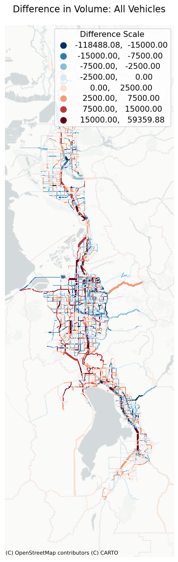

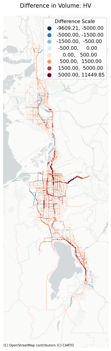
Looking at the All Vehicles map, the model volumes are lower than observed for by more than 7,500 vehicles per day for the east side of I-215 and by more than 15,000 vehicles per day for I-15 through northern Utah County. Model volumes are higher than observed volumes by more than 15,000 vehicles for I-15 in southern Salt Lake County and for I-15 in Utah County between Springville and Spanish Fork. When looking at these areas by vehicle type, volumes for both Medium Trucks and Heavy Trucks are slightly greater than observed. Overall, the volume differences between model and observed are relatively minor.
The lower arterial model vs observed volumes of Heavy Trucks on 9000 South in Salt Lake County was further investigated. The Heavy Truck observed volume for this roadway seemed much higher than expected for this roadway. The lower volumes are likely due to the observed data and not anything in the model.
Average Travel Time
The model’s average travel time was compared to observed data between (how many) various origin and destination locations throughout the model space. Observed travel times came from the Google API for various times throughout 2019. All observed data was collected on Tuesday through Thursday. Due to a data collection issue, observed average travel times were only available for the WFRC area. Model data came from the final network skims that report travel times between every TAZ by period.
The validation results for average travel time are shown in the following figures. Looking at the EV period and knowing that evening speeds are similar to freeflow, we can deduce that in general the model’s freeflow speeds are about 10% faster than observed. In addition, a pattern exists in the AM, MD, and PM periods where shorter trips (under 20 minutes) have shorter travel times than observed and longer trips (30-60 minutes) have longer travel times than observed. This suggests that the volume-delay function (VDF) curves are slightly too aggressive on higher end facility types (freeways and arterials). Overall, while these charts show an acceptable range of error, improvements to freeflow speeds and to the VDF curves are adjustments we will consider making in future models.